The Value of Enduring
Brandmarks
By Anthony Biles, Principal & Creative Director, Biles Hendry
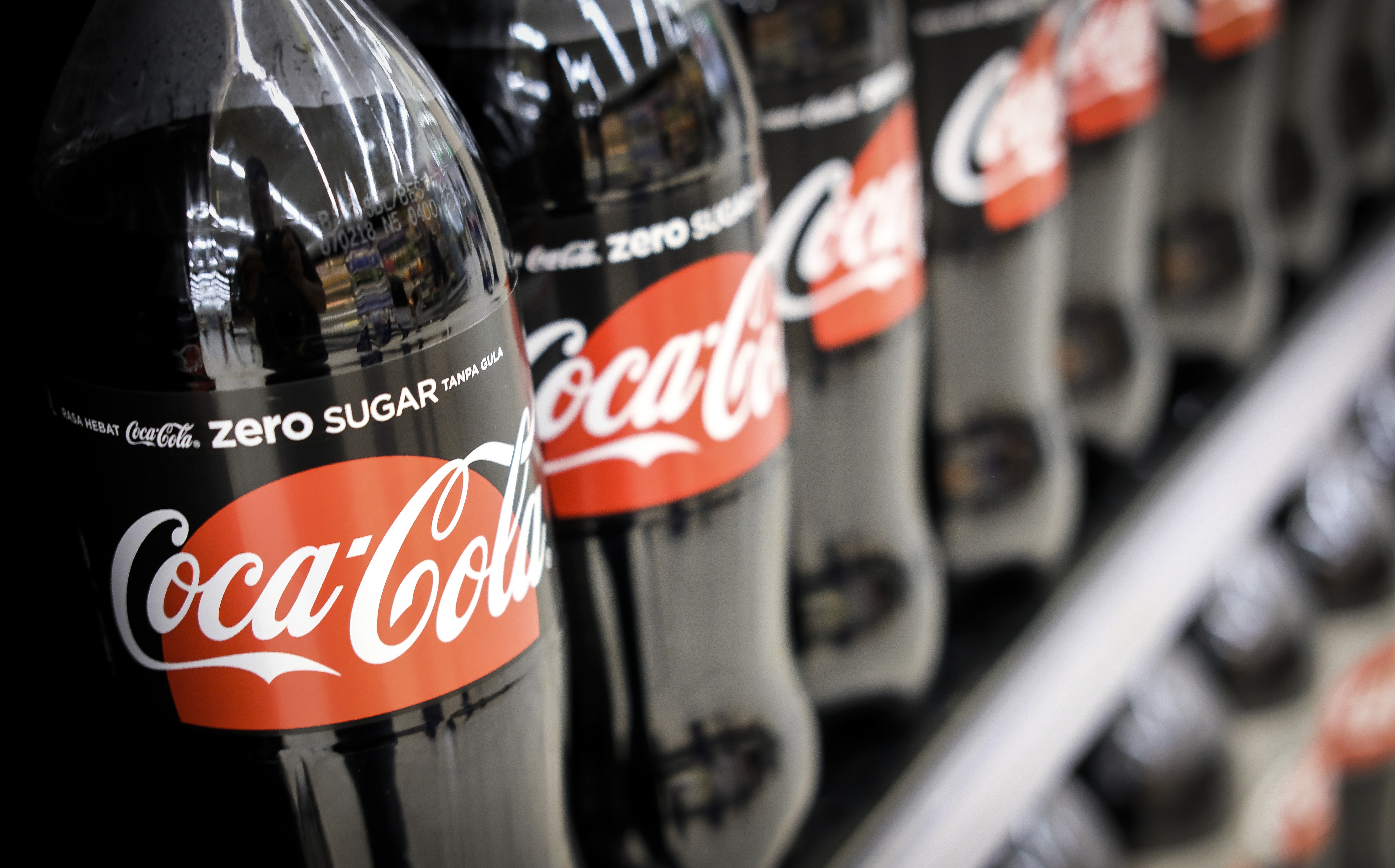
The most successful brandmarks stand the test of time. Look at Coca-Cola which has barely changed in 120 years. Contrast this to Pepsi which has been transformed roughly once every 20 years. Is it a coincidence therefore, that Coke’s market share is roughly double Pepsi’s, or does it reflect a brand who have drilled down to their true essence including capturing this in an effective logo.

Of course other commercial and marketing factors play their part, but for Coke and for many of the world’s most successful brands identity matters. Nike knows the value of its swoosh.

Since they found the golden arches in the 60s, McDonald’s have kept them front and centre.

And while Apple may have experimented with execution a little in the 2000s, at its core it’s always been that highly recognisable bitten apple.

There are of course many highly successful companies that have transformed their logos every few years. Yet in most cases this has involved significant marketing spend filling a void created by the absence of an enduring brandmark.
Redesigning logos is expensive, not only in design fees but also in establishing the new mark, implementation and updating marketing. Make no mistake, Coca-Cola, Nike, McDonalds and Apple have invested heavily in the subtle evolution of their marks over the years, but it is a less significant spend than those that start with an almost clean slate every few years.
Furthermore, consumers don’t like to see companies spending money in this way. Think of the public outrage over British Airways, Gap or more recently BT. Much of this is ill-informed tabloid ranting, but it speaks to the more profound issue of consistency and trust.
When a logo changes people question, often at a subconscious level, what else has changed. Has there been a takeover? Has the product or service changed? Will it be inferior to before? The brandmarks that endure, that remain recognisable year after year after year slowly accrue trust, credibility, recognition and that vital element of brand building: They become a flag that short cuts to the brand’s values.
Think tick, arches, apple and smile. Nike, McDonalds, Apple and Amazon have successfully associated these symbols with their brands, by keeping them at the centre of their identities for decades. Look back beyond the age of the consumer brand to the cross, the star, the thumbs up or down. Symbolism has long been part of how we humans communicate with each other, and how we build recognition and trust.
As we have seen in these examples, it may not be the first logo a brand has, and often wont be. But there is great value in getting it right once and for all, and a marvellous perquisite in creating brand legacy.
Of course, no one sets out to create a logo that will be changed every five years. When I was a young designer in San Francisco 21 years ago, tasked with the creation of a logo for an online retailer, I aimed to capture the essence of the brand, and design an image that would stand the test of time. In 2020 the logo remains entirely unchanged and Amazon is one of the largest and best recognised companies in the world.
In the following posts in this series I’ll share my views on how to create a logo that endures, and I’ll tell the story of how I created that famous and lasting smile.
– END –