How I Created
the Amazon Logo

By Anthony Biles, Principal & Creative Director, Biles Hendry

Amazon logo designed by Anthony Biles

My horologist father once told me about how you can tell if you are in a good clock maker’s shop: the hands of the clocks for sale are all set at ten to two – the clocks are smiling.

Original Amazon Logo

THE PREVIOUS AMAZON LOGO

Traditional alarm clock

This was the central truth behind the idea of the Amazon logo which I created as a young designer at Turner Duckworth in San Francisco. Amazon was taking on the established booksellers, offering more choice, lower prices and greater convenience. It was making people happy.

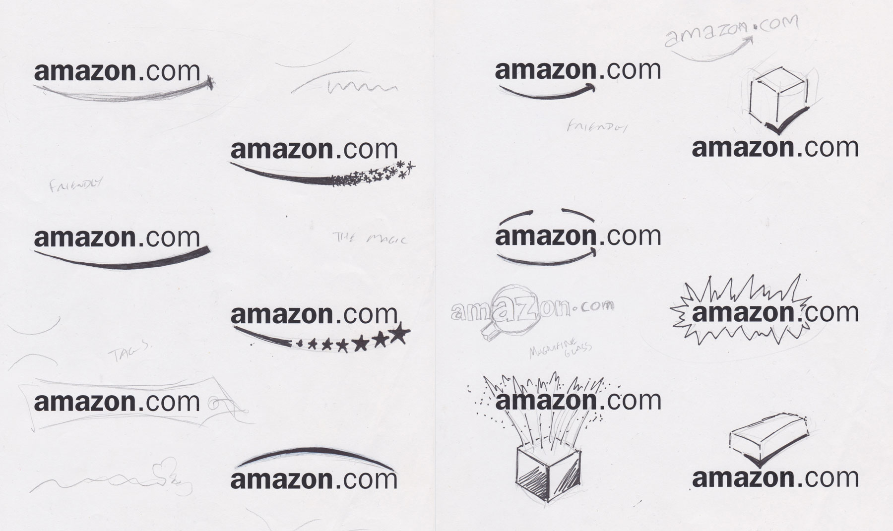
Amazon logo design concepts

 ABOVE: FROM THE ORIGINAL CONCEPT SHEETS

RIGHT: ANTHONY BILES IN CALIFORNIA IN 1999

Anthony Biles in 1999

So for me it seemed entirely natural to take the generic underline that was  on the existing logo, and shape it into a smile. It stood out from the other creative routes – such as bold Amazonian warriors or digitised shopping carts – because it was rooted in the brand proposition rather than the service and because it was born of fundamental semiotics. When we’re happy… we smile.

However it needed to be ownable, more than just a smile. Dropping one dimple and crafting the other so it was also an arrowhead spoke to both happiness (smile) and delivery service (Arrow). I then shortened the line from full length underscore to integrated mark by adding a ‘cheek’ to the ‘z’ and making it point from A to Z, a nod to Amazons intention to go beyond books to selling just about everything, from AA batteries to Zips.

Example of Amazon website

From a commercial perspective, it wasn’t a radical departure from the existing logo proportions. It would fit effortlessly into the online spaces where the previous meaningless and forgettable mark already appeared – and most notably on what was a bland brown box – giving it a whole heap of personality.

And so it has been ever since. They’ve added words and colours as they’ve added new services and sub-brands, but it is essentially the the same logo I designed in San Francisco more than two decades ago appearing on all Amazon sites and on more than 2.5 billion parcels delivered worldwide every year. One of those rare logos that has remained the same, playing its part in helping Amazon become one of the world’s largest companies.

Delivery man carrying large parcel
Amazon packaging

–  END  –

How I Created the Amazon Logo

By Anthony Biles, Principal & Creative Director, Biles Hendry

Amazon logo designed by Anthony Biles

My horologist father once told me about how you can tell if you are in a good clock maker’s shop: the hands of the clocks for sale are all set at ten to two – the clocks are smiling.

Original Amazon Logo

 THE PREVIOUS AMAZON LOGO

Traditional alarm clock

This was the central truth behind the idea of the Amazon logo which I created as a young designer at Turner Duckworth in San Francisco. Amazon was taking on the established booksellers, offering more choice, lower prices and greater convenience. It was making people happy.

Amazon logo design concepts

 FROM THE ORIGINAL CONCEPT SHEETS

Anthony Biles in 1999

ANTHONY BILES IN CALIFORNIA IN 1999

So for me it seemed entirely natural to take the generic underline that was  on the existing logo, and shape it into a smile. It stood out from the other creative routes – such as bold Amazonian warriors or digitised shopping carts – because it was rooted in the brand proposition rather than the service and because it was born of fundamental semiotics. When we’re happy… we smile.

However it needed to be ownable, more than just a smile. Dropping one dimple and crafting the other so it was also an arrowhead spoke to both happiness (smile) and delivery service (Arrow). I then shortened the line from full length underscore to integrated mark by adding a ‘cheek’ to the ‘z’ and making it point from A to Z, a nod to Amazons intention to go beyond books to selling just about everything, from AA batteries to Zips.

Example of Amazon website

From a commercial perspective, it wasn’t a radical departure from the existing logo proportions. It would fit effortlessly into the online spaces where the previous meaningless and forgettable mark already appeared – and most notably on what was a bland brown box – giving it a whole heap of personality.

And so it has been ever since. They’ve added words and colours as they’ve added new services and sub-brands, but it is essentially the the same logo I designed in San Francisco more than two decades ago appearing on all Amazon sites and on more than 2.5 billion parcels delivered worldwide every year. One of those rare logos that has remained the same, playing its part in helping Amazon become one of the world’s largest companies.

Delivery man carrying large parcel
Amazon packaging

–  END  –

© 2014- Biles Hendry
The Think Blot logo is a registered trademark of Biles Hendry