Devon
Sent.
Increasing meaning, presence and appeal through provenance and straight-talking, to drive substantial new listings and sales.
WHAT WE DID
Brand Strategy | Visual Codes & Brand Equity | NPD | Brand Messaging | Brand Architecture| Range Architecture | Copywriting | Brand Identity | Packaging Design | Photography | Artwork | Print Management | Brand Guidelines | Trade Show Stand Design & Consultation
BACKGROUND
Burts have been making best quality hand cooked crisps with great flavours for over 20 years. Based in Devon and selling predominantly in the South West, Burts have ambitions to be a significant national and international player. The design project kicked off with branding and the design of the core potato chips range, but grew to cover multiple range extensions, new ranges, NPD and limited partnerships with the likes of the RNLI and Guinness.
SOLUTION
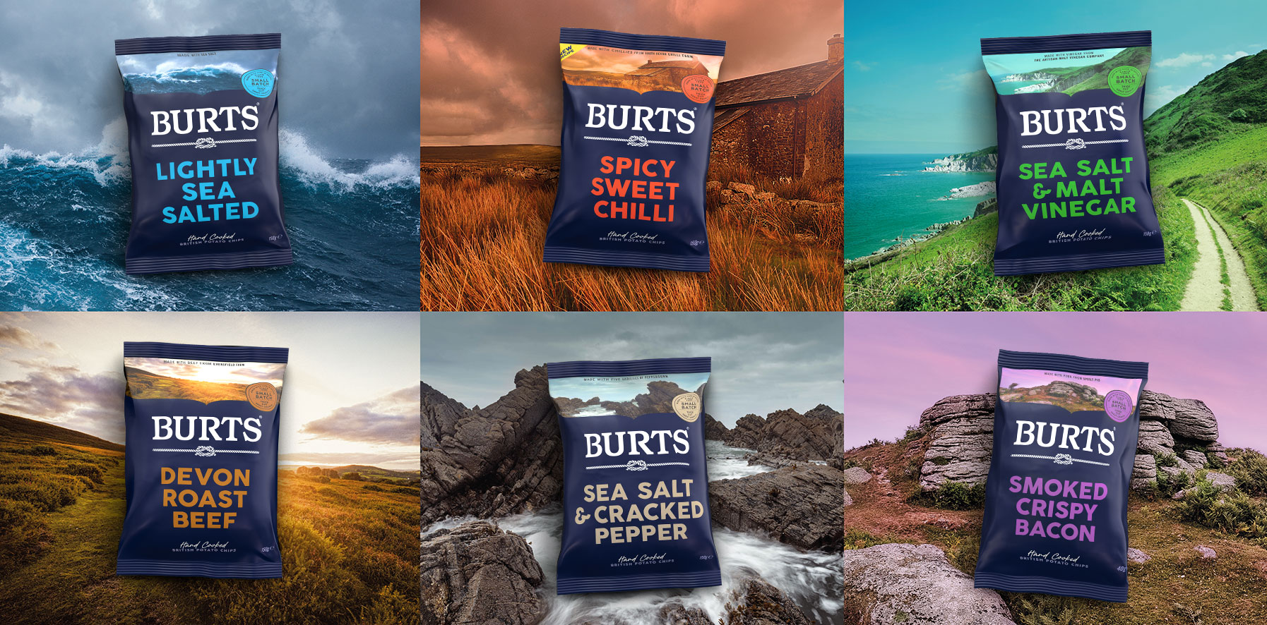
The design is bold and simple, yet lovingly crafted – just like Burts’ potato chips themselves. Capturing their authentic Devonshire coast location and strong relationships with local farmers and suppliers, the new logo features two ropes joined with a naval knot, a nod to this maritime provenance and symbolic of Burts’ strong partnerships. The branding boldly introduces a dark navy blue brand colour and photography of Devonshire landscapes and farmlands that sit at the top of each pack, which further reflect their story alongside confident type that communicates the big, bold flavours.
“We are absolutely thrilled at Burts with the new packaging. The design looks truly amazing, and we have already received a universally positive reception. It’s recognisably Burts, but communicates so much more than the old design, ensuring that consumers get a sense of exactly who we are.“
Dave McNulty, CEO – Burts Snacks


