Smart
snacking.
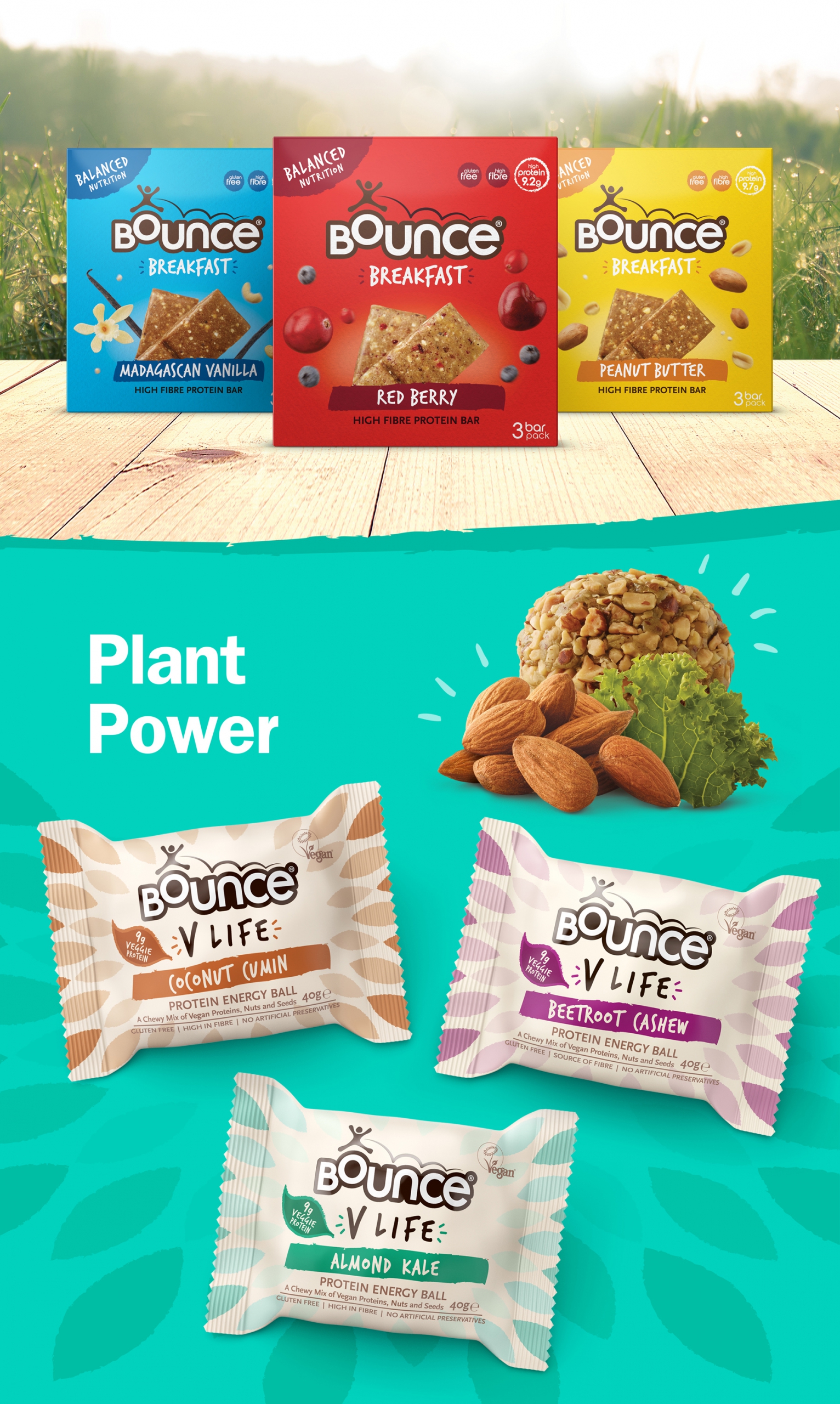
When Bounce said jump, we asked ‘how high’? Our redesign for Bounce unlocked their real reason for being, allowing us to reposition their great product, leading to a massive lift in sales.
- Year 1: +95% sales uplift (like for like, with no advertising, no PR and no price promotions).
- DBA Design Effectiveness Gold award winner.
- Turnover from £480k before redesign to £7.2 Million in three years (with no advertising, no PR and no price promotions).
- Five years on and Bounce started PR activity, turnover £12M in the UK alone with a similarly strong presence in Australia and a growing presence in Europe, Australia and Canada.
WHAT WE DID
Brand Strategy
Codes & Equity Analysis
Brand Identity
Brand Messaging
Range Architecture
Packaging Design
Printed Collateral
POS
Copywriting
Artwork
Print Management
Brand Guidelines
+ + + Read more
BACKGROUND
Protein as a USP is ubiquitous now, but back in 2009, the only people searching out such products were gym bunnies. This combined with the fact that ‘healthy’ back then meant worthy, had wrong footed Bounce into uninspiring packaging and static growth.
SOLUTION
Our insight repositioned Bounce as a mainstream healthy well-being snacking brand with a proposition around positive energy and feeling good; the emotional and physical result of eating natural, healthy, balanced food. Breaking with convention, we created the first mainstream protein snack, inviting consumers to ‘grab life’. The outcome, a breathtaking result for the brand – £7.2 million three years on from redesign (£6.7 million in growth).


